An Illustrated History Of Interior Design

From shag carpeting to shabby chick to IKEA, this interactive infographic visualises a history of interior design.
image

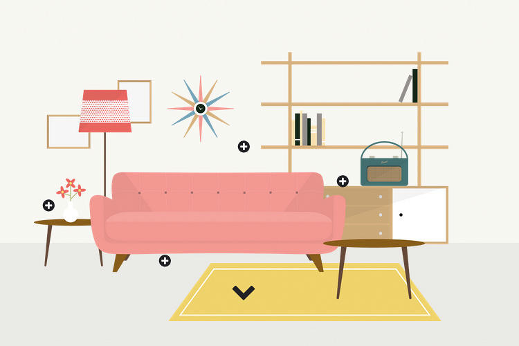
1950s interior design was characterized by modernism and influenced by the Danish design movement, with crisp, sweeping lines and vivid coloring.
image

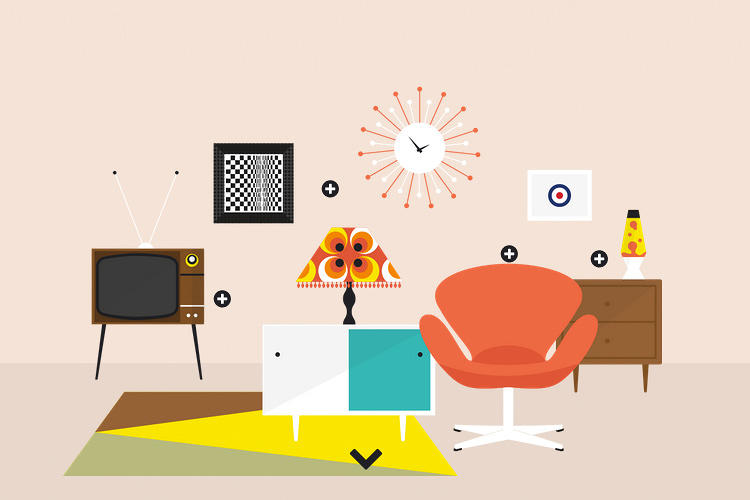
During the free love movement of the 1960s, interior designers reacted to the wholesome, traditional family values of the ‘50s with post-modernist riffs on elements of the past (Victorian and Georgian-inspired furniture) and the imagined future (groovy lava lamps).
image

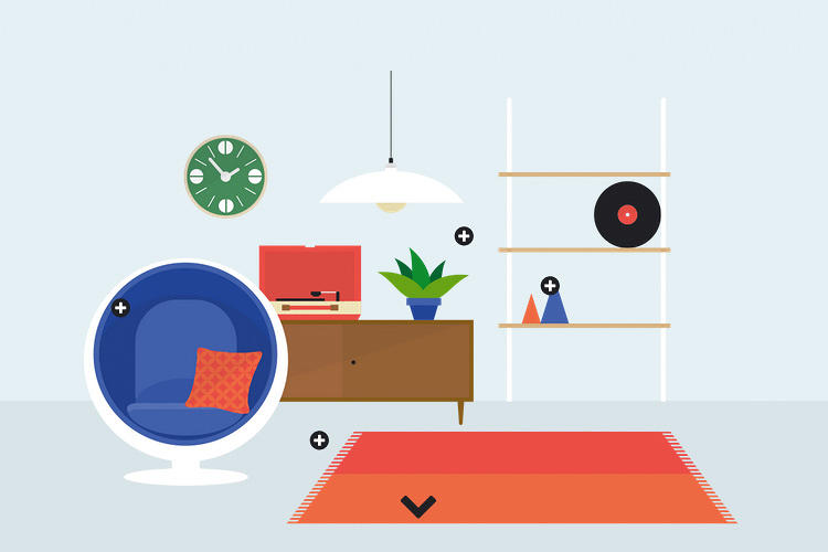
The 1970s saw the birth of DIY culture, Space Age-influenced styles (like that pod chair), and the hippie movement’s preference for rustic, “natural” furniture of teak and pine.
image

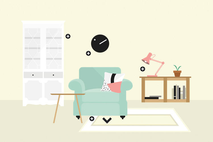
The 1980s saw the birth of “shabby chic” and the avant garde Memphis Group in Milan, with furniture in bold geometric shapes and colors. The decade of excess also brought plenty of chintzy, ostentatious interiors.
image

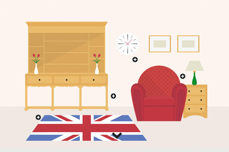
1990s interior design reigned in the excess of the '80s, opting for more minimalism and lots and lots of pine furniture.
image

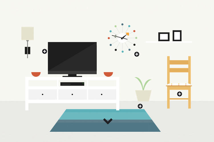
The 2000s saw the Ikea flatpack furniture takeover and a bigger integration of tech into interior design, with flatscreen TVs channeling home cinema.
image

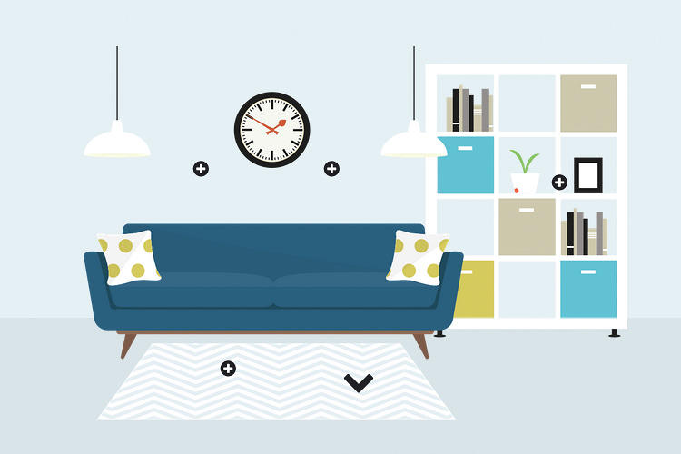
In the 2010s, self-expression has come to define the approach to interior design. So has economizing–the recession has led to smaller furniture with built-in storage.

Inspired by FastCoDesign; Images from Harvey Water Softeners

5 Timeless Design Elements from Mad Men: Home Edition

This is part two of the post featuring the stylish furnishings of our favourite period drama, Mad Men. As we dive into the homes of our favourite TV style icons, we recognise most of the items chosen are associated with Betty, but to be fair nobody has a better grasp of suburban 1960’s life and style than the former Mrs Draper. 

Here’s 5 Timeless designs and elements that you can incorporate into your space today:

1. Betty and Don’s bed

image

If only Betty and Don’s relationship was as perfect as this frosty blue velvet, button tufted bed head. The material is certainly fitting for this era and the fact that it provides a comfortable resting spot for Betty’s weary head, that’s just a bonus.

2. The muted coral walls in Joan’s apartment

image

This dusk pink, coral wall suits Joan to the core. The teal, coral and cream colour mash up in Joan’s living room perfectly portrays her precise, non-frivolous personality. The choice of furniture is more traditional and the arrangement clean and simple. It is not a playful setup, but none the less Joan is not a playful character outside of work. I certainly would not want to be caught making a mess at her place.

3. Megan and Don’s manhattan apartment

image

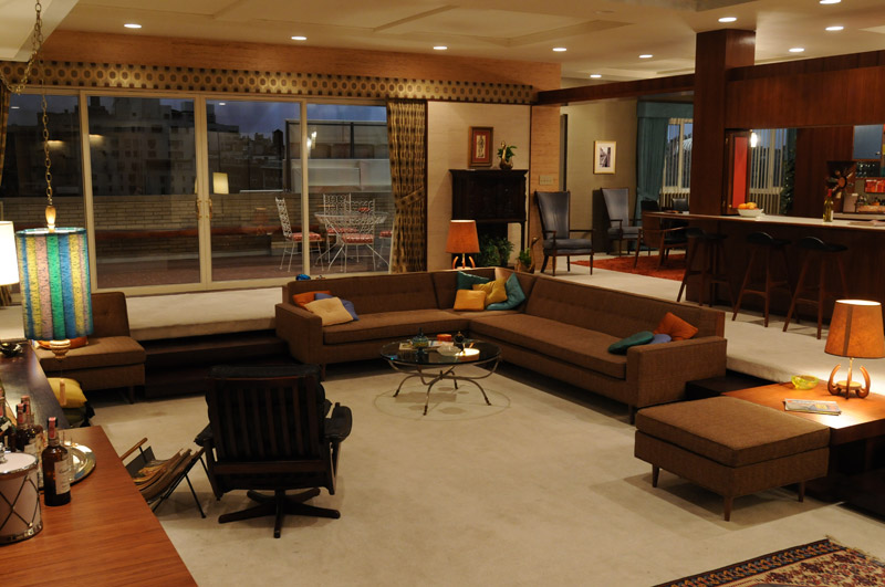
Megan and Don’s manhattan apartment are a perfect portrayal of their relationship. Although we feel for Betty and her perfect housewife despair, we can’t help but feel the attraction of the lifestyle that being with Megan offers. Don’s a curious, ambitious and flirtatious man, we can’t help but agree that this is a home that suits Draper. 

4. Betty’s suburban kitchen

image

Notice the green and pink hues again with Betty’s suburban kitchen. I dare say the greens and oranges were a popular colour scheme in the 60s. There is a homely charm to the kitchen, though in today’s day and age, a spray of high gloss white with original wooden bench tops would give the kitchen a brighter lift away from the melancholic watermelon scheme that represents that suppressed depression enveloping Betty Draper.

5. Black Barcelona leather daybed

image

Technically, this doesn’t count as home furnishings but we couldn’t resist finishing off with this delightful Mies Van der Rohe Barcelona daybed. The piece looks just as good at Betty’s Psychiatrist’s office as it would any home or office in this day and age. We’ve seen few settings of this daybed under elegant ceiling down window sills. Absolutely classic.