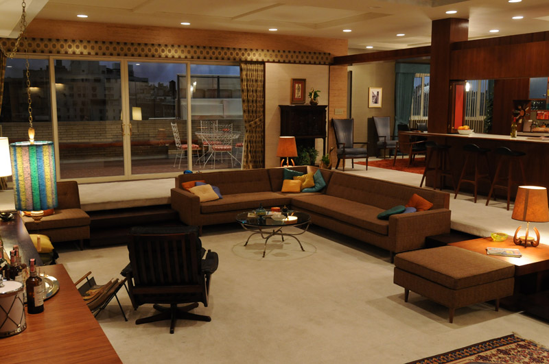
5 Chairs That Changed The World

image

What is it about a chair that can make our hearts flutter?

It’s really just something to sit on, yet it is so much more than that. Chairs have never been defined just by their functional roles, think of the difference between a throne and a bench. A good chair will have you stand back and admire it’s beauty, yet immediately want to walk up and have a seat.

Here are five chairs that have obtained ‘classic’ status, and blur the boundary between furniture and sculpture.

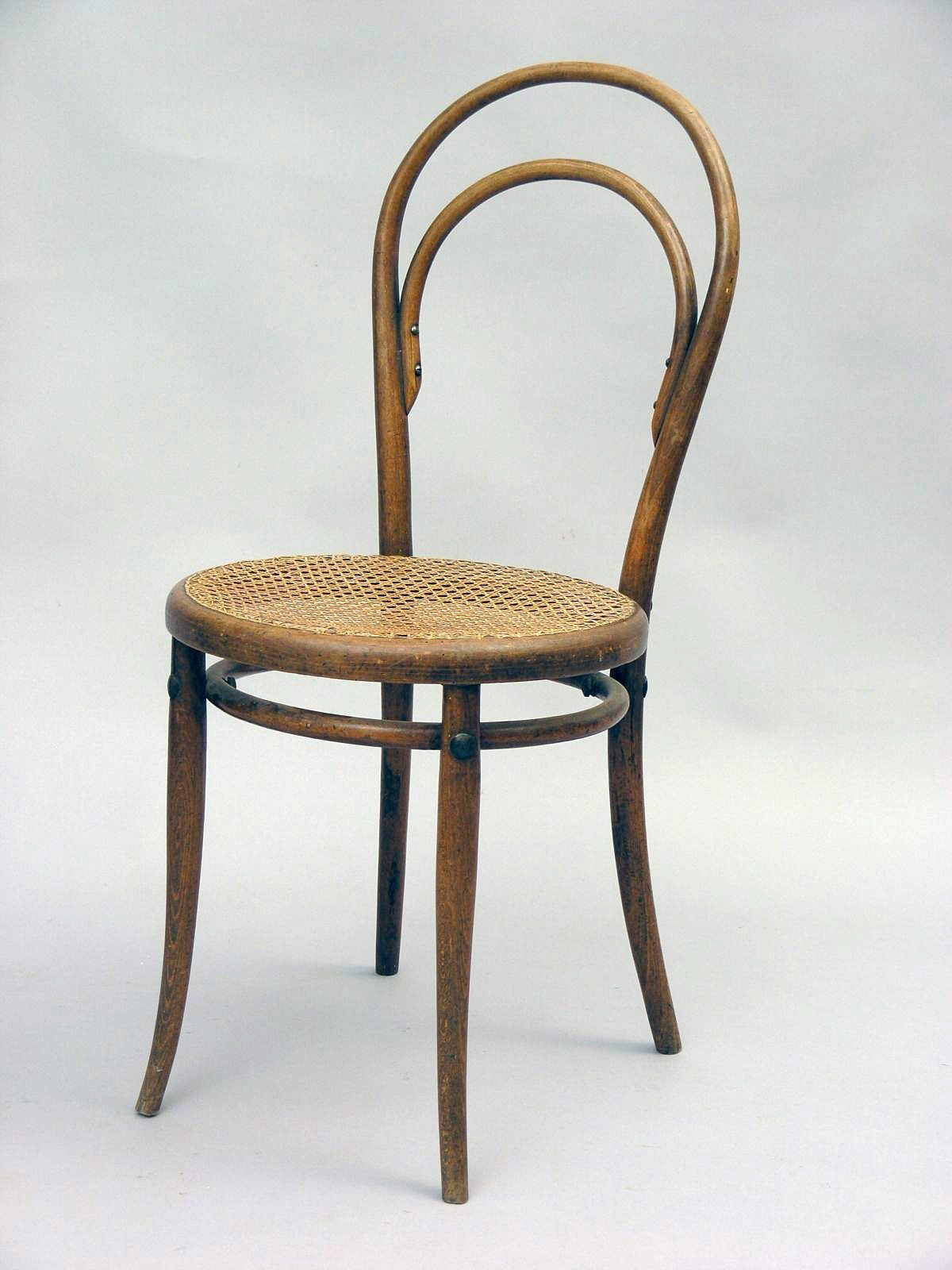
1. Michael Thonet’s 214
image

When Michael Thonet first introduced his bentwood chair in 1859, little did he know that over 150 years later it would still be in production. The ’214′, also called the coffee-house chair, became the first mass produced chair in the world. It has been in continuous production since, with over 50 million chairs produced to date.

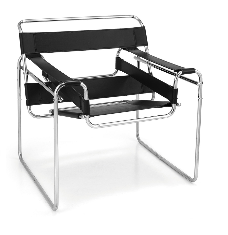
2. Marcel Breuer’s Wassily Chair
image

This revolutionary chair is named after the painter Wassily Kandinsky. The tubular steel frame design was revolutionary and Breuer first got the idea from his bicycle. Made in 1925, this chair became even more popular when 1950′s mass production brought the cost down.

3. Ludwig Mies Van Der Rohe’s Barcelona Chair

image

In 1929, Mies van der Rohe designed this chair for the German Pavilion at Barcelona. It was intended as seating for the King and Queen. Today this chair is seen in many corporate lobbies and ultra modern homes.

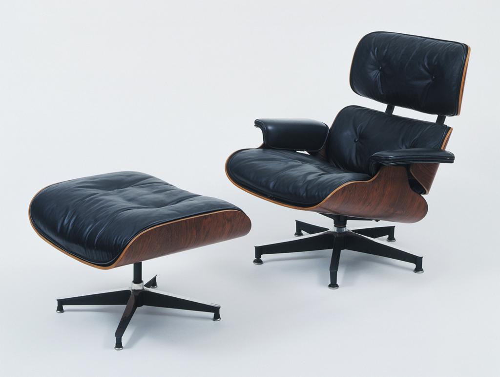
4. Eames Lounge Chair
image

Designed for Hollywood film director Billy Wilder in 1956, the Eames Lounge Chair blurs the boundaries between office and home. It is a beautifully comfortable chair, while being simply splendid to look at. Made of luxurious materials, it still is a favourite with many today.

5. Arne Jacobson 3107 Chair

image

Arne Jacobsen was one of the most important contributors to Danish design and Danish modern architecture. He enjoyed worldwide success with his simple but effective chair designs. This chair was inspired by Charles and Ray Eames’ designs and is now one of the most copied chairs in the world.

Always surround yourselves with things that you love. Don’t forget to look for beauty in everyday items, like the simple chair.

Inspired by KarenFron; Images from Karenfron, Hawksworth Interiors

5 Timeless Design Elements from Mad Men: Home Edition

This is part two of the post featuring the stylish furnishings of our favourite period drama, Mad Men. As we dive into the homes of our favourite TV style icons, we recognise most of the items chosen are associated with Betty, but to be fair nobody has a better grasp of suburban 1960’s life and style than the former Mrs Draper. 

Here’s 5 Timeless designs and elements that you can incorporate into your space today:

1. Betty and Don’s bed

image

If only Betty and Don’s relationship was as perfect as this frosty blue velvet, button tufted bed head. The material is certainly fitting for this era and the fact that it provides a comfortable resting spot for Betty’s weary head, that’s just a bonus.

2. The muted coral walls in Joan’s apartment

image

This dusk pink, coral wall suits Joan to the core. The teal, coral and cream colour mash up in Joan’s living room perfectly portrays her precise, non-frivolous personality. The choice of furniture is more traditional and the arrangement clean and simple. It is not a playful setup, but none the less Joan is not a playful character outside of work. I certainly would not want to be caught making a mess at her place.

3. Megan and Don’s manhattan apartment

image

Megan and Don’s manhattan apartment are a perfect portrayal of their relationship. Although we feel for Betty and her perfect housewife despair, we can’t help but feel the attraction of the lifestyle that being with Megan offers. Don’s a curious, ambitious and flirtatious man, we can’t help but agree that this is a home that suits Draper. 

4. Betty’s suburban kitchen

image

Notice the green and pink hues again with Betty’s suburban kitchen. I dare say the greens and oranges were a popular colour scheme in the 60s. There is a homely charm to the kitchen, though in today’s day and age, a spray of high gloss white with original wooden bench tops would give the kitchen a brighter lift away from the melancholic watermelon scheme that represents that suppressed depression enveloping Betty Draper.

5. Black Barcelona leather daybed

image

Technically, this doesn’t count as home furnishings but we couldn’t resist finishing off with this delightful Mies Van der Rohe Barcelona daybed. The piece looks just as good at Betty’s Psychiatrist’s office as it would any home or office in this day and age. We’ve seen few settings of this daybed under elegant ceiling down window sills. Absolutely classic.