Tour The ‘50 Shades Of Grey’ Movie Mansion
How would you like a tour of Christian Grey’s house?
Casa Mia in Vancouver was used as the location for Mr Grey’s impressive home, in Sam Taylor Johnson’s movie, which wrapped shooting in March.
Lead stars Jamie Dornan and Dakota Johnson shot scenes in the gorgeous Spanish Colonial Revival style house, and now it’s been announced by the Vancouver Heritage Foundation that public tours of the landmark will commence on June 1.
Built back in 1932, the three-storey home features a grand ballroom, eight bedrooms and even a nursery with hand-painted designs made by original Disney artists.


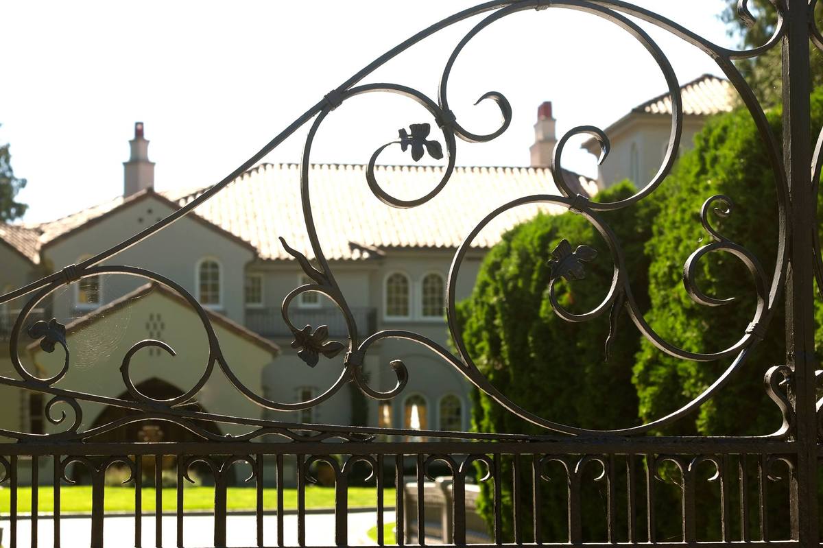
More photos can be found here.
Inspired by Entertainmentwise; Images from Huffington Post.
Amazing Portraits Recreated With Recycled Materials
Jane Perkins is a UK artist who uses found objects and recycled materials to create something new. She recreates famous artworks and portraits using found objects in an ongoing series called Plastic Classics.
Perkins gets most of her materials from charity shops, boot sales and the recycling centre in Exeter; along with donations from friends and neighbours. Each piece usually takes about three weeks and she initially uses a glue gun so she can play with the layout and move objects around. Once satisfied, she paints the whole artwork with a layer of diluted PVA glue.
See more of her work on www.bluebowerbird.co.uk
1. Afghan Girl (based on photograph by Steve McCurry/National Geographic)

2. Usain Bolt

3. Albert Einstein

4. Nelson Mandela

5. Kate Middleton

Images from AvaxNews.
5 Ways To Add Swank To Your Bar Cart
There are people who drink, and then there are people who have drinks.
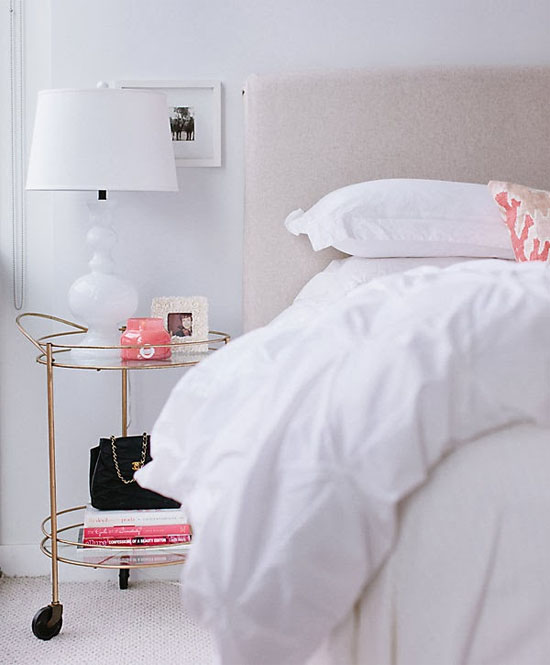
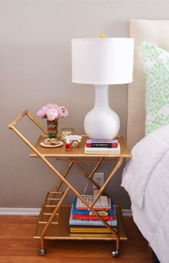
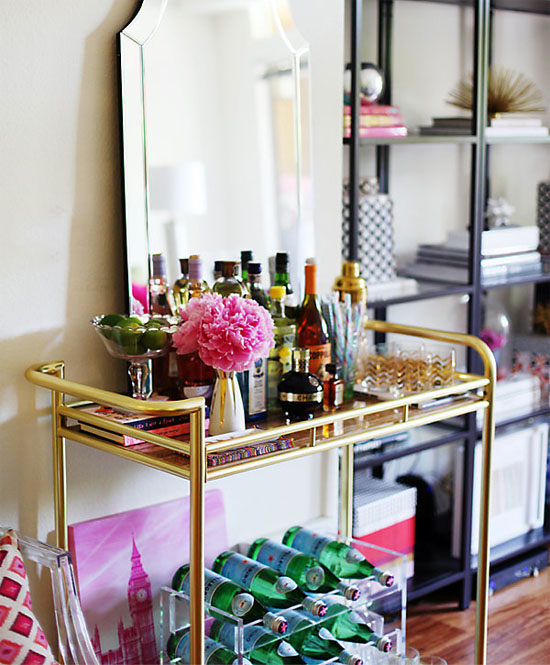
Those who own a bar cart certainly understand how sexy it is to display a good collection of booze. But apart from stocking alcohol, did you know that there are other creative ways to put it to use.
1. As a Nightstand
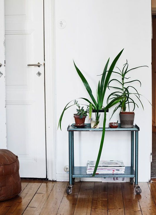
2. As a Plant Stand
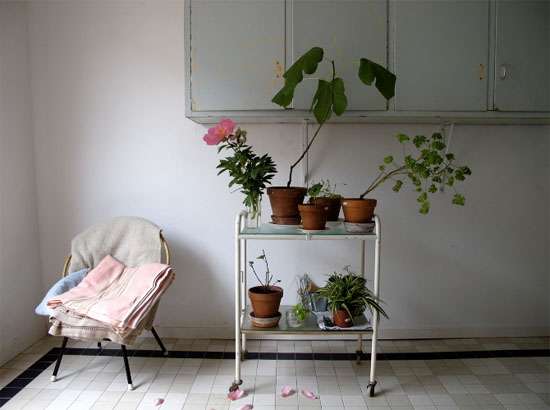
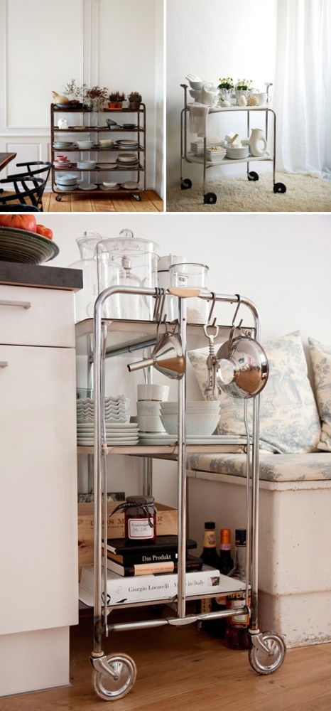
3. To Store Dishes and Kitchen Supplies

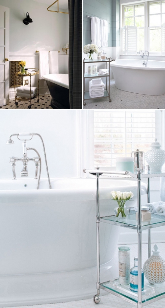
4. To Store Towels and Bath Necessities

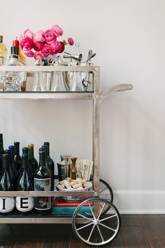
5. Or Simply to Stock Alcohol and Make Your Home Feel Baller
Inspired by AtHomeInLove: Images from AtHomeInLove.
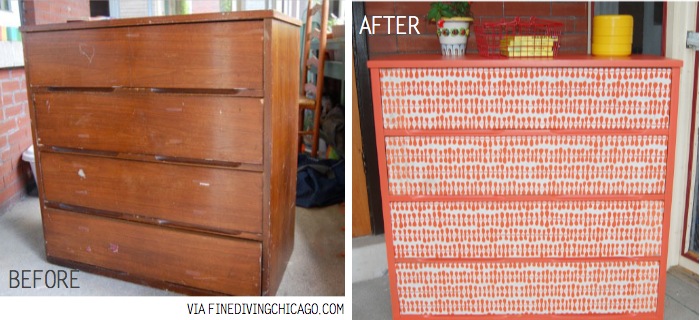
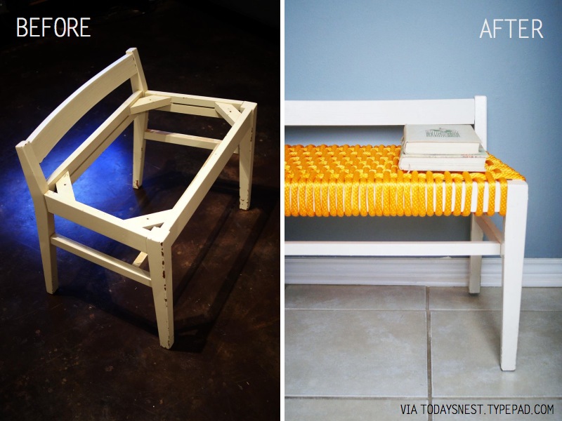
Pimping Your Scruffy Piece Beyond Recognition
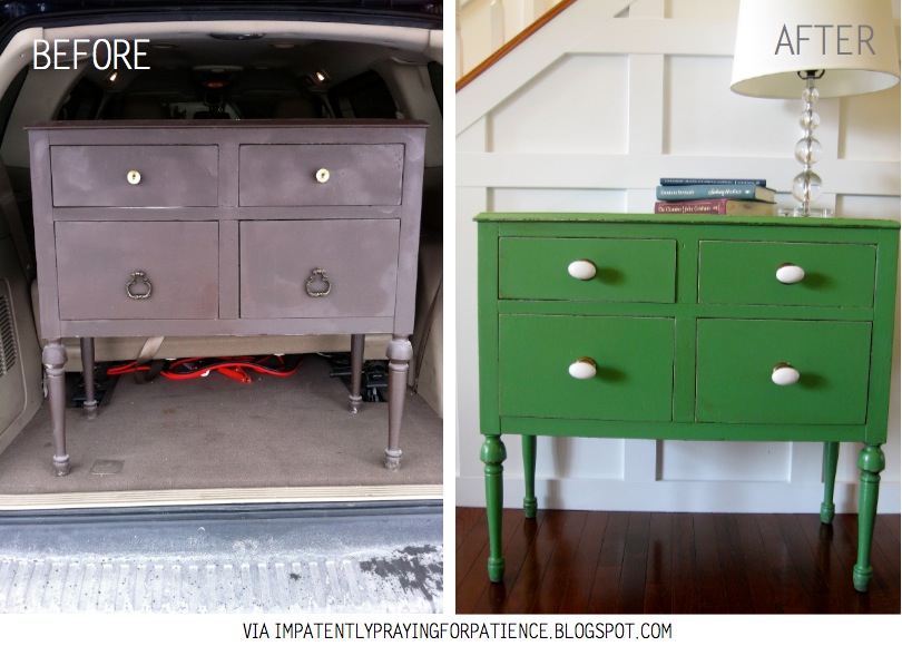
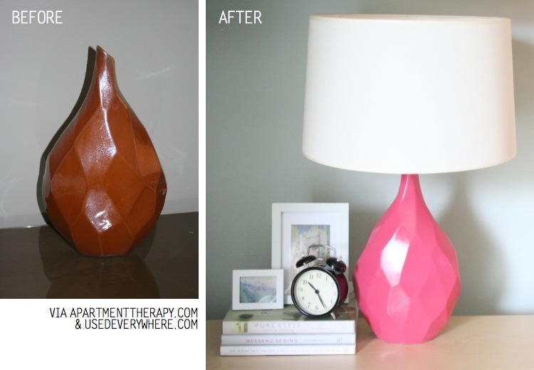
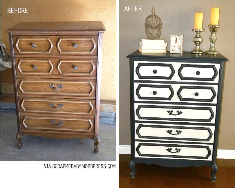
All you need is some creativity and paint to pimp any scruffy piece beyond recognition.
Here are some fresh ideas and inspiration on how to restore and re-love old furniture!
Green Energy
Prettier In Pink
Black & White Bliss
Ray of Sunshine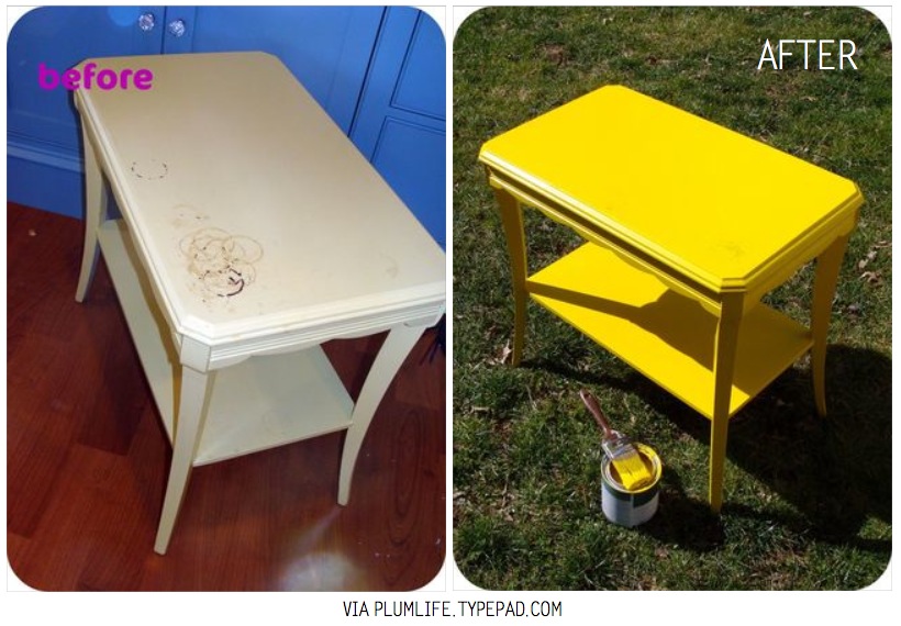
Peppermint Breeze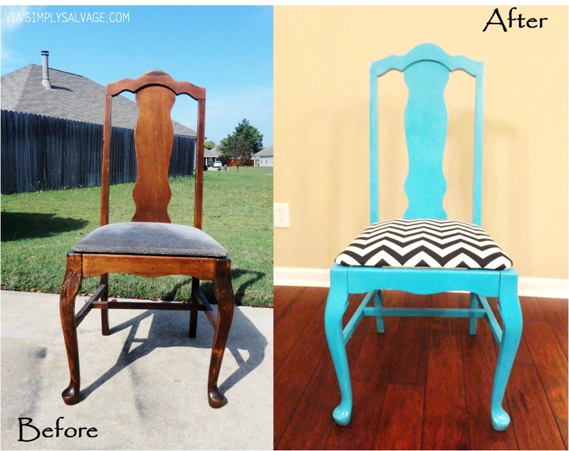
Zesty Orange
Denim Delight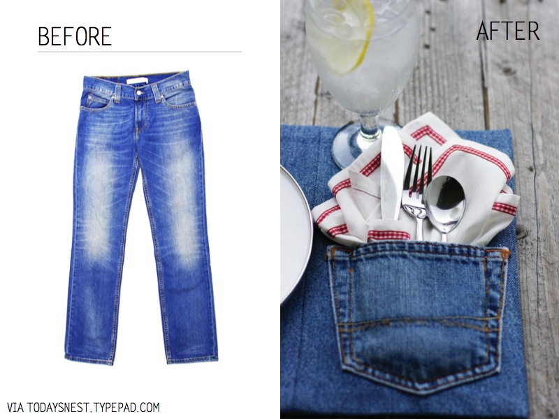
Ruby Relish
Terrifically Turquoise
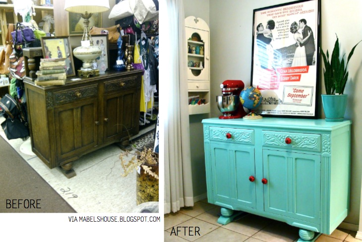
Truly Blue Baby I Love You
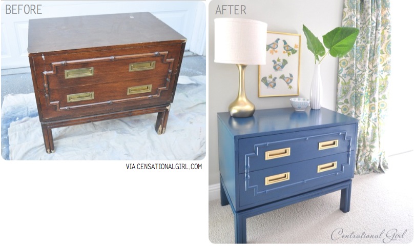
Crispy Grey
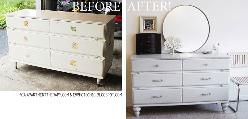
Bright White LIght
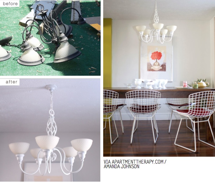
Lively Lime
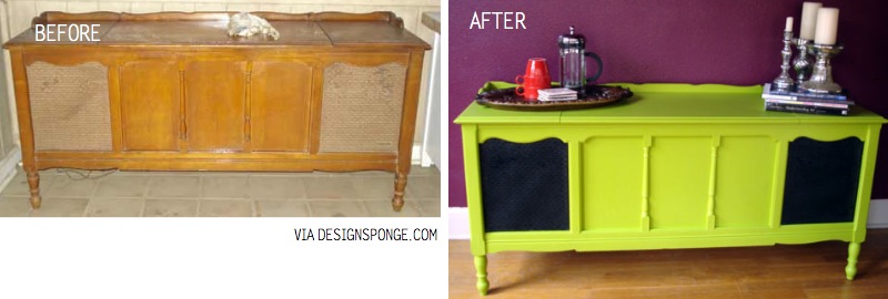
Clad in Coral
Rope Remake
Inspired by Scraphacker; Images and sourced from: ImpatientlyWaitingForPatience, UserEverywhere, PlumLife, ApartmentTherapy, TodaysNest, FineDivingChicago, DesignSponge, ScrapMeBaby, SimplySalvage, Centsationalgirl, MabelsHouse
7 Decorating Ideas for your Bookshelf
Bookshelves not only store all your favorite books, but they also give you a place to display decorative accessories.
It gives you a chance to bring in color, texture and personality to a room. And that can be accomplished even when the shelves are only holding books. Here are seven decorator ideas to help you create beautifully arranged bookshelves.
Decorating Bookshelves
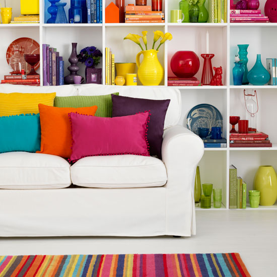
1. Use bookshelves to carry on your color scheme. Unify the look by adding accessories that repeat the main colors of the room.
House to Home
2. When lining up multiple bookshelves with adjustable shelving, vary the heights of the shelves in each unit. This will add movement and visual interest.

Sharon Portnoy Design
3. To give bookshelves a sleeker more polished look, add glass doors. The doors will also help cut down on your dusting.

Houzz
4. Create a stylish and unexpected display by hanging artwork and other decorative items from the front of bookshelves.

Houzz
5. Make your built-in bookcases standout by painting them in a contrasting color from the walls.

Houzz
6. If you have lots of colorful books and accessories, bring in some black-and-white artwork to break up all the color.

Houzz
7. Don’t overload bookshelves with lots of accessories. Keep things simple and it won’t look cluttered. Take time to step back and view your display to see if it’s balanced and visually pleasing.

Better Homes and Gardens
~
Hop on to the Couchelo iPhone App to see our many unique, vintage and contemporary decor items to decorate your bookshelves with.

This month we will be announcing a winner each week for our launch celebration - giveaway competition. Enter to find out if you are the lucky winner. So many lovely and unique pieces to choose from on our app. Visit couchelo.com to download our app and get hunting.
Fighting Poverty with Design
A product designed by Dutch designer Pepe Heykoop to be made in an Indian slum has been a runaway success, creating employment for 80 families within a year of launch.
Pepe Heykoop & Tiny Miracles Foundation, Mumbai workshop from Pepe Heykoop on Vimeo.
Speaking to Dezeen in Milan last week, Heykoop said workers making his Paper Vase earned the equivalent of eight Euros per day.
“The ambition is to have 700 people out of poverty in ten years time,” said Heykoop. “We are pretty much half way”.
Initially launched in February last year, Heykoop presented the vase at Ventura Lambrate in Milan this year along with a range of other products he designed as part of a project organised by charity the Tiny Miracles Foundation to lift people out of poverty in Mumbai.
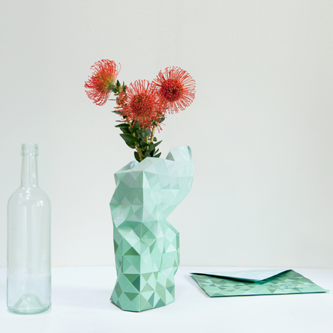
Online orders for the vase are averaging around 100 per day, allowing the foundation to keep 80 families in regular employment.
However the other products proved unsuitable to the project, which struggled for the first couple of years.
“In 2012 we never thought this was actually happening and now there’s light at the end of the tunnel and there’s a really good vibe going,” Heykoop said.
The success of the flat-pack vase – which is made of paper and sewn together – has led Heykoop to develop another folded paper product. Prototypes of his flatpack Paper Lamp were on show at Ventura Lambrate.
“The paper vase was the breakthrough and for 2014 I have this paper folded light, which has the same principal and has been flat-packed in an envelope,” said Heykoop.
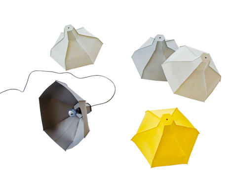
After they’re made, the products are shipped from Mumbai to Heykoop’s studio in Amsterdam then distributed to consumers worldwide. However, if the buyers live east of India then the designs are shipped straight from there to save them travelling all the way around the world.
The Tiny Miracles Foundation, set up in 2010, is half way towards its goal for 2020 to provide 150 families with a wage of ten euros a day – the UNICEF standard for a middle class wage – in return for their production skills.
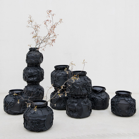
Heykoop’s original ideas for the project were lampshades from lambskin, transforming traditional water carriers into leathery vases, but the products proved difficult for the community to produce and too expensive for consumers to purchase.
“I started off with leather lampshades; they’re like 550 Euros in the shop,” he said. “It’s nice when you sell a bunch of them but you have work and then you don’t have work for a few weeks. These ladies were coming to me and asking ‘can I work next month’, and I wanted to say yes but I couldn’t, because the products were not selling on a daily basis.”
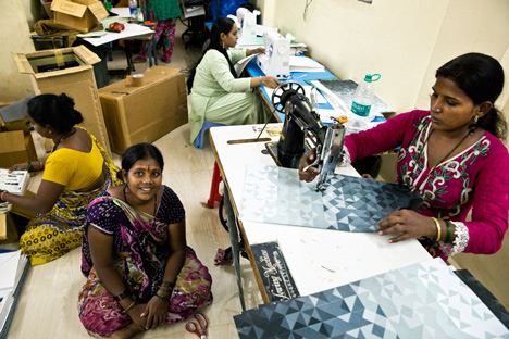
Heykoop hopes to train the families in Mumbai to manage the distribution themselves, so the process becomes contained within the community after the programme finishes in six years time.
This foundation stops in 2020 but it doesn’t mean that this workshop stops in 2020,“ Heykoop explained. "If we stop the workshop in 2020, it will all collapse again. If the foundation stops providing the information, then they should be self sustainable.”
~
Get to know more about Pepe Heykoop @ http://www.pepeheykoop.nl/
All content and images from Dezeen
5 Celebrity Homes We Love
1. Glee star Jayma Mays and actor Adam Campbell in the living room of their Los Angeles home.
Click here for our post on Jayma May’s Los Angeles Home.
2. Mary Kate Olsen and Olivier Sarkozy’s $13.5 million, 8000 square feet Turtle Bay Garden Home
Click here or image for our post on Mary Kate Olsen’s Home.
3. Jonathan Adler’s Kaleidoscopic New York Apartment
Click here or image for our post on Jonathan Adler’s Home.
4. Ellen Degeners and Portia De Rossi’s horse ranch home in Santa Monica Mountains.
Click here or image for our post on Ellen and Portia’s Home.
5. Scarlett Johansson and Ryan Reynold’s Ex Establishment. The Buff & Hensman designed “Wong House” was built in 1969 in the Los Feliz hills.
Click here or image for our post on Johansson and Reynold’s Home.
Armed with a keen eye for design and a yen for vintage furniture shopping, Glee star Jayma Mays and actor Adam Campbell revitalize a formerly jumbled Los Angeles house.
The pair scoured vintage shops and flea markets for furniture, lighting, and accessories. “It was a lot of trial and error,” says Mays
“There was one new couch that Jayma was obsessed with,” says Campbell. “It was probably the price of a car. And she kept looking at it and thinking, Do we buy this? The budget forced us to be a bit more creative. I think ultimately it worked out much better than if we had spent a lot of money on high-end stuff because it would look a bit less ‘us.’”
(image and source from: dwell)


