Fighting Poverty with Design

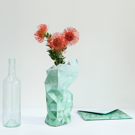
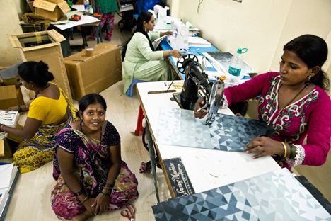
A product designed by Dutch designer Pepe Heykoop to be made in an Indian slum has been a runaway success, creating employment for 80 families within a year of launch.

Pepe Heykoop & Tiny Miracles Foundation, Mumbai workshop from Pepe Heykoop on Vimeo.

Speaking to Dezeen in Milan last week, Heykoop said workers making his Paper Vase earned the equivalent of eight Euros per day.

“The ambition is to have 700 people out of poverty in ten years time,” said Heykoop. “We are pretty much half way”.

Initially launched in February last year, Heykoop presented the vase at Ventura Lambrate in Milan this year along with a range of other products he designed as part of a project organised by charity the Tiny Miracles Foundation to lift people out of poverty in Mumbai.
image

Online orders for the vase are averaging around 100 per day, allowing the foundation to keep 80 families in regular employment.

However the other products proved unsuitable to the project, which struggled for the first couple of years.

“In 2012 we never thought this was actually happening and now there’s light at the end of the tunnel and there’s a really good vibe going,” Heykoop said.

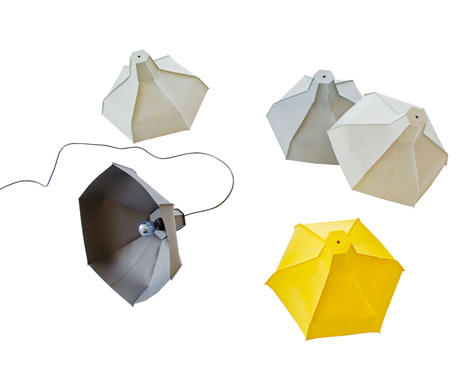
The success of the flat-pack vase – which is made of paper and sewn together – has led Heykoop to develop another folded paper product. Prototypes of his flatpack Paper Lamp were on show at Ventura Lambrate.

“The paper vase was the breakthrough and for 2014 I have this paper folded light, which has the same principal and has been flat-packed in an envelope,” said Heykoop.
image

After they’re made, the products are shipped from Mumbai to Heykoop’s studio in Amsterdam then distributed to consumers worldwide. However, if the buyers live east of India then the designs are shipped straight from there to save them travelling all the way around the world.

The Tiny Miracles Foundation, set up in 2010, is half way towards its goal for 2020 to provide 150 families with a wage of ten euros a day – the UNICEF standard for a middle class wage – in return for their production skills.
image

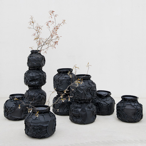
Heykoop’s original ideas for the project were lampshades from lambskin, transforming traditional water carriers into leathery vases, but the products proved difficult for the community to produce and too expensive for consumers to purchase.

“I started off with leather lampshades; they’re like 550 Euros in the shop,” he said. “It’s nice when you sell a bunch of them but you have work and then you don’t have work for a few weeks. These ladies were coming to me and asking ‘can I work next month’, and I wanted to say yes but I couldn’t, because the products were not selling on a daily basis.”
image

Heykoop hopes to train the families in Mumbai to manage the distribution themselves, so the process becomes contained within the community after the programme finishes in six years time.

This foundation stops in 2020 but it doesn’t mean that this workshop stops in 2020,“ Heykoop explained. "If we stop the workshop in 2020, it will all collapse again. If the foundation stops providing the information, then they should be self sustainable.”

~

Get to know more about Pepe Heykoop @ http://www.pepeheykoop.nl/

All content and images from Dezeen

Big things are coming!

image

A few weeks ago, the Couchelo team pulled off our first ever product shoot thanks to our talented interior designer Jeanette Del Zio, fabulous photographer James Truong and a selection of some very special items from our friends at Rudi Rocket, Collectika, Drunk on the Moon, addVintage and French Folie. Here’s a sneak peak behind the scenes:

image

The team is hard at work here setting up the mid-century home shoot. Check out the gorgeous wire sofa and brightly printed cushions from Collectika and the retro-chic folding screen from addVintage.

image

This charming rooster oil painting from Rudi Rocket would look just as good in your office as it would your home and we love the rustic charm of this collection of bright blue milk jugs from French Folie.

image

Empty gilded photo frames from Drunk on the Moon stacked together make for a quirky wall art while the wooden nesting bowls from Collectika are just begging to be filled with fruit.

image

Our camera shy co-founders Will and Fei feel right home in this French farmhouse setup. We’ve got those stunning vintage suitcases from French Folie on their wishlist!

A special thanks to newlyweds Jenny and Wayne for lending us your beautiful apartment.

Stayed tuned for BIG things to coming March (psst, our app is almost ready so sign up here to be one of the first people to give a test drive)!

Text by Jessica Li.

5 iconic pieces of furniture in film

With the 86th Academy Awards night just around the corner, the Couchelo team is reminded of what important good set design is in telling the story so we’ve created a list of feature furniture pieces that have gained cult status of their own:

1. Henrik Thor-Larsen’s Ovalia Egg Chair

Ovalia Egg Chair

Made popular by Men in Black, this particular Egg Chair was designed in the 1960s but is so timeless that it look right at home in the future as it would have some half a century ago.

2. Bocca Lip Sofa

Boca Lip Sofa

This retro favourite from Austin Powers, The Spy Who Shagged Me was originally inspired by Salvator Dali’s Marilyn museum sofa in a colour very atypical of the mod era.

3. Mies van der Rohe Barcelona Chair

Knoll Barcelona Chair

The Barcelona chairs from Casino Royale in M’s apartment are a classic act in an apartment that is a stylish extension of her steely composed self.

4. Ruby Chesterfield Armchair

Ruby Chesterfield Armchair

The sophisticated ruby leather armchair that Morpheus is lounging in when Neo decides between the red and the blue pill in is juxtaposed against the harsh reality of the Matrix.

5. Clawfoot Bathtub Sofa

Clawfoot Bathtub Sofa

And who can forget Holly Golightly’s bathtub sofa in Breakfast at Tiffany’s, a perfect place to entertain guests and or curl up with Cat if you’ve got a case of the mean reds.

Text by Jessica Li. Images sourced from An Patel; Retro Furnish; Mad About the House; Fedge and Candana.

Our favourite upcycled bookcases

Author C.S Lewis once said “I can’t really imagine a man really enjoying a book and reading it only once” so we’ve rounded up our favourite upcycled bookcases that you can DIY to showcase your growing collection.

1. Tree branches

Tree branch bookcase

Simple and chic, these repainted tree branches bring a bit of the outdoors inside.

2. Stacked coffee tables

Coffee table bookcase

Painted in the same purple hue, these stacked coffee table add a bright pop colour to the muted wall.

3. Baby grand piano

piano bookcase

Give new life to an unused baby grand piano, this statement bookcase would be perfect for any music lover.

4. Maze of drain pipes

drain pipe bookcase

These repurposed drain pipes are a cool way of incorporating a cultured element into any man cave.

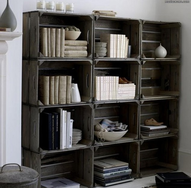
5. Stacked wooden crates

crate bookcase

If you have a bunch of identical old crates lying around, why not stack them up and use them to showcase your books and prized possessions?

6. Baroque photo frames

photoframe bookcase

These black photo frames provide a quirky alternative to wall art and the fact they serve a dual purpose is a bonus.

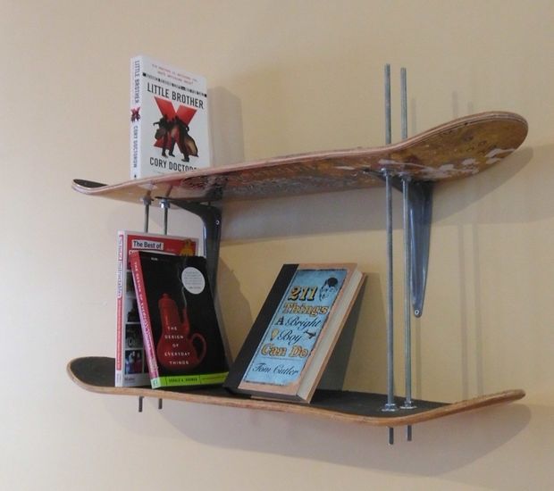
7. Skateboard

skateboard bookcase

Old skateboards can make for a fun and imaginative bookcase and the perfect place to store all your childhood favourites.

Text by Jessica Li. Images sourced from Qaaks; Creative Home Idea; Tina Blaine; iiDudu; Top Dreamer and Fresh Home.

5 Timeless Design Elements from Mad Men: Office Edition

Mad Men

Season 7 of Mad Men premieres on April 13 and the Couchelo team are waiting impatiently for the return of Don Draper’s antics, gorgeous 1960s fashion and most of all, the retro-chic home and office furnishings. The use of bold colours, crazy textures and clean lines makes Mad Men our favourite source of décor eye candy on TV.

So let’s take a look through the past seasons for 5 timeless designs elements that you can incorporate into your office space today:

1. The burnt orange sofa with clean lines 

Burnt orange sofa with clean lines

Technically, there are two elements typical of mid-century design we love here (three, if you count Don’s trilby): the burn orange palette is something we’ve come to expect from the era and the clean lines and button-tufted sofa adds a simple pop of colour to the monochrome space.

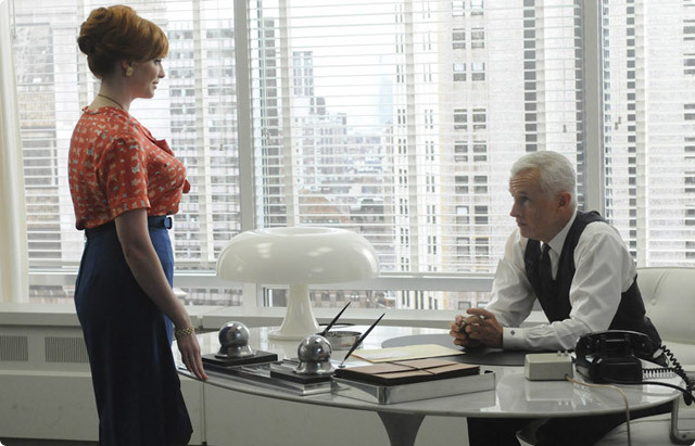
2.  The “tulip” table and “mushroom” lamp in Roger’s Office

“Tulip” table and “Mushroom” lamp

Roger Sterling’s office is a light and bright minimalist space where he spends most of his days drinking and contemplating the future of his on-again-off-again love affair with vixen Joan. Styled by his ex-wife Jane, we particularly love the mod-signature pieces such as the white Saarinen Tulip table and the Artemid Nesso desk lamp featured above.

3. The conference chairs in the creative’s lounge

Conference chairs

The makeshift copywriter’s conference room reflects the young and progressive crowd who occupy it. The Saarinen Executive Conference Chairs provide an appropriately professional touch to an otherwise eclectic mix of furnishings.

4. The gold chinoiserie folding screen

“Chinoiserie folding screen in goldFolding screens were all the rage in the 1960s and this oriental design was no doubt the influence of eccentric partner Bert Cooper’s obsession with the Far East. We like how the folding screen’s bold print provides a welcome distraction from the heavy use of solid colours in the space.

5. The wooden bar cart in Don’s office

“Wooden bar cart

And what post about Mad Men would be complete without an ode to the excessive drinking that Don Draper and Co. take part in at the office. Situated conveniently next to his desk, the wooden bar cart is simple and functional, with everything Don needs to make his Old Fashioneds.

Text by Jessica Li. Images sourced from: GQ; Elle Decor; Modern Digs; The Office Stylist; Be Colorful and The Good Men Project.

5 Amazing Shipping Container Homes

House made of 31 shipping containers

Realestate.com.au recently listed an incredible one-of-a-kind house in Brisbane, made of 31 shipping containers. Designed by Todd Miller of Ziegler Build, the three-story property cleverly uses the container’s original interior to create an industrial chic effect.

Shipping container homes are popping up everywhere. With over 200 million empty units sitting in ports around the world, turning them into inhabitable spaces is an eco-friendly solution for those looking for something a little outside of the box.

The possibilities are endless. Here ’s a few of our favourite upcycled houses:

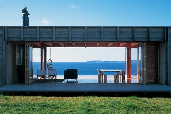
1. Coromandel Beach House

Coromandel Beach House

This gorgeous holiday home in New Zealand designed by Crossan Clarke Carnachan Architects makes the most of the beach views with an open-planned living space and large windows in the front and back of the house.

Coromandel Beach House

It features two bedrooms, one bathroom, kitchen, folding cedar shutters along the length of the house and even has a fireplace for entertaining on chilly winter nights.

2. Redondo Beach House

Redondo Beach House

The stunning Californian multi-shipping container house designed by Peter Maria Design Associates has won coveted architecture awards. It boasts two bedrooms, one bathroom, kitchen, an artist’s studio, a library and an outdoor lap pool.

Redondo Beach House

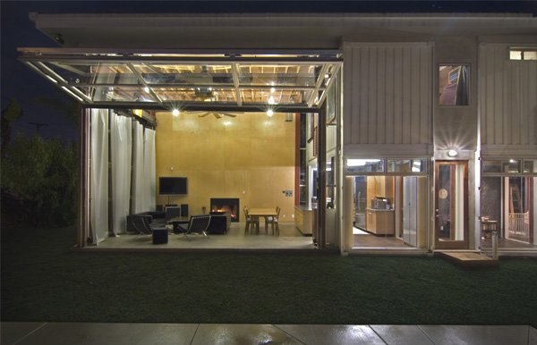
The living space has an impressive 6m ceiling with an even more impressive floor to ceiling window which folds up and opens out to the garden.

3. The Manifesto House

The Manifesto House

This funky three shipping container house was a 90-day project by Chilean construction company Infiniski, which came in at a budget friendly $118,000.

The Manifesto House

The entire house is 85% made out of recycled, eco-friendly and reused materials, with wood-slatted exterior and solar covers on walls and roofs. The interior furnishings fits the cool designer bill too.

4. Container of Hope

Container of hope

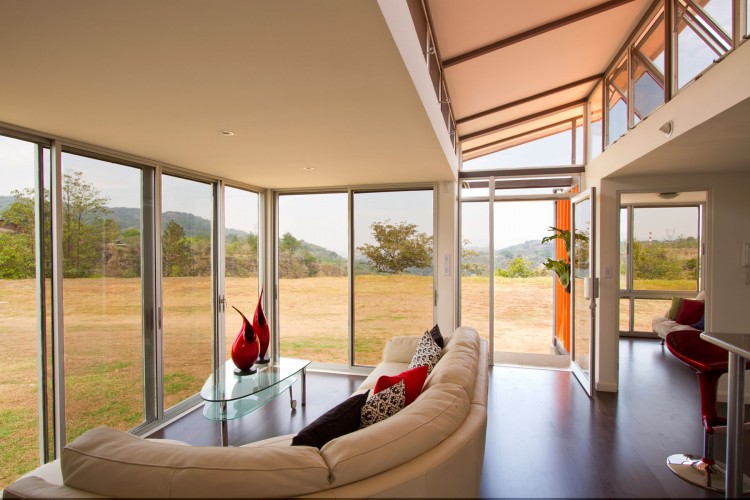
Architect Benjamin Garcia Saxe turned two shipping containers into this bold, modern space by cutting out an entire side wall and setting them apart with a raised mid section.

Container of hope

The house was built for under $40,000 for a couple who dreamed of living a simpler life in rural Costa Rica.

5. Container Guest House

Last but not least, this cute as a button guest house designed by Award-winning US firm Poteet Architects in Texas complements its bright exterior with bamboo walls and floors and a planted roof top.

Container Guest House

Text by Jessica Li. Images sourced from: realestate.com.au; One Kind Design; Eco Container Home; Gizmag; Home DSGN and Remodelista.

  • container home
  • shipping container
  • architecture
  • real estate
  • design
  • eco friendly
  • sustainable
  • upcycle

Pallet Patio Furniture

Beautiful blue skies and balmy summer temperatures are keeping us all outdoors well into the evening. Recycling and some diy time can help you transform your unused balcony or courtyard into a beautiful space to enjoy entertaining guests. 

Here are some ideas from 1001 Pallets to get you started! 

Pallet Table: 

Cheap and easy to make! Perfect for outdoor dining over the summer. Tutorial here. 

image

Pallet Bar:

Become the host with the most by transforming an old pallet with a few splashes of paint into a mini bar for a drinks session. Tutorial here.

 image

Pallet Daybed:

With a few extra cushions and padding, pallets prove to be perfect for outdoor lounging. Tutorial here. 

image

Image Credit: 1001 Pallets

10 Ways To Decorate With Radiant Orchid, Pantone’s 2014 Color Of The Year

Say goodbye to emerald, it’s time for Radiant Orchid, Pantone’s Color Of The Year 2014, which Executive Director Leatrice Eiseman of the Pantone Color Institute, describes as “an enchanting harmony of fuchsia, purple, and pink undertones.”

We absolutely love this bold color which inspires creativity and ingenuity - one that may appeal to design-focussed, tech-savvy people in their 20s and 30s. “Radiant Orchid reaches across the color wheel to intrigue the eye and spark the imagination,” says Eiseman. “An invitation to innovation, Radiant Orchid encourages expanded creativity and originality, which is increasingly valued in today’s society.”

So what does this mean when it comes to interior design? Well, if you’re a fan like we are, use these ideas to incorporate a vibrant splash into your home decor.

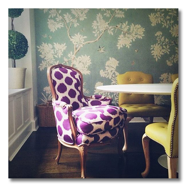
1. Dining Chairs With Subtle Charm

Blue Kitchen by Cacco Main Interiors

Whether you choose a traditional/eclectic or a highly modern layout, apply a combination of colors, fabrics, textures and lighting fixtures to make your place feel like home.

2. Romantic Throw Pillows

Romantic Throw Pillows by Pinterest

Pillows in this colour work perfectly with neutrals as well as adding a romantic feel to any bedroom or living room.

3. Modern Interior Delight

Different Shades by Pianca

Pairing shades of purple and maroon against white walls provide a sophisticated feel in a modern interior.

4. Complimentary Colors

Pink and Yellow by ADFL

Pink and yellow are both stubborn yet complimentary colors - yet they can look so awesome together.

5. Patterns and Prints

A Small Accent

We are sure to see even more patterns and prints in this eye-catching color in the months ahead.

6. Accent With Nature

Radiant Orchid Floral Decor

Flower color trends tend to follow those in fashion and decor too. Expect to see radiant orchid in weddings and special events in the coming months.

7. Vibrant Furnishings

Westchester Showhouse 2011

Modern fresh, yet has roots to its tradition which is so inviting.

8. Upholstered and Homey

Minimalist Kitchen Home Decor by Become Gorgeous

Upholstered dining sets are comfortable and homey and make it easy to linger over breakfast newspaper or a conversation.

9. Brass Tones

Brass Tapware by Candana Sydney

Pairing this tone with brass tapware is a winning combination, its the type of color that works well with both traditional and contemporary fixtures.

10. Got Art?

Radiant Orchid Artwork by The Suite Life

A centrepiece artwork in this expressive and exotic color invites confidence and warmth.

New Year’s customs: Jo'burg furniture throwing voted one of the strangest

The New Year’s custom in Hillbrow, Johannesburg, of throwing furniture out of windows of tall buildings has been voted one of the strangest customs worldwide to bid farewell to the old year and ring in the new.

image

The local custom came fourth in a poll conducted by social networking site Badoo.com, which asked 7 200 users in 18 countries to vote for the strangest and most fun New Year’s customs.

The Chilean city of Talca’s custom of spending New Year’s Eve at a cemetery to be with dead relatives won the poll for the strangest custom.

A Romanian custom of trying to hear animals talking – where failing to do so brings good luck – came second, followed by the Irish practice of banging bread on the wall to scare away evil spirits.

Following Johannesburg’s fourth place was a Siberian custom of diving into a frozen lake carrying a tree, and a custom in North Carolina in the United States where you lower a possum over a noisy crowd.

The Johannesburg custom also took fourth place as the most fun New Year’s custom.

The mass kiss-in in Venice, Italy, Mexico’s practice of wearing red underwear for good luck and a three-day water fight in Thailand took the top three places in the fun category. 

Those looking for new furniture in the new year, and finding ways to offload their old furniture have to look no further than Couchelo. Looks like we’d be sweeping up the streets for the New Year if we were in Johannesburg. 

Happy New Year Everyone!

Xmas Feasts & Treats!

As we approach the holidays, restaurants in Sydney are being booked out for Christmas lunches and dinners. Here is a list of our favourites where the design is just as good as the food with or without the turkey..

The Grounds of Alexandria

With a wholesome approach to food and design, the Grounds of Alexandria has become a Sydney cafe staple. A former pie factory, the fit-out provides an inviting contemporary spin whilst maintaining the integrity of the former warehouse. 

7A/2 Huntley St Alexandria NSW 2015

image

(image by Michael Wee)

Mr Wong

Mr Wong’s interiors instantly creates a mise-en-scene of 1930s Shanghai with its jazz music and striking colonial-style furnishing. An incarnation of Tank nightclub, the dark timber floors and existing structural elements prove to complement the new additions including blue cement tiles and a mural of a period-specific Asian lady. The traditional Cantonese themed food adds the final touch for complete immersion into old Shanghai. 

3 Bridge Lane Sydney, NSW 2000

image

(image by Paul Gosney)

The Morrison Bar & Oyster Room

The former Brooklyn Hotel is transformed into a New York-inspired hospitality venue encouraging patrons to feel at home with communal dining tables and clustered stools. The  interior uses indoor plants to create an intimate setting, with large street-facing windows recreating a stoop-like people watching experience. Watch out for the occasional $1 oyster treats. 

225 George St Sydney, NSW 2000

image

(image by Murray Fredericks)

Adriano Zumbo Patisserie

A real life mini Willy Wonka factory is invoked in the design of this sugar patisserie. Well known for the unique macaron flavours, Zumbo’s latest instalment uses a ‘dessert train’ to add to the intrigue of this quirky and colourful venue. 

Shop 1 Cafe Court, The Star, 80 Pyrmont St Pyrmont, NSW 2009

image

(image by Murray Fredericks)

Mejico

Mejico has successfully captured the essence of a Mexican canteen whilst avoiding all the cliches of the culture. It has a predominantly neutral palette with touches of vibrant colours from the occasional item of furniture or from the food itself. Bold graphics on both the walls and floors provide a high level of energy perfectly complementing the mix of chillis and peppers. 

105 Pitt St, Sydney 2000

image

(image by Juicy Design)